 Spigen
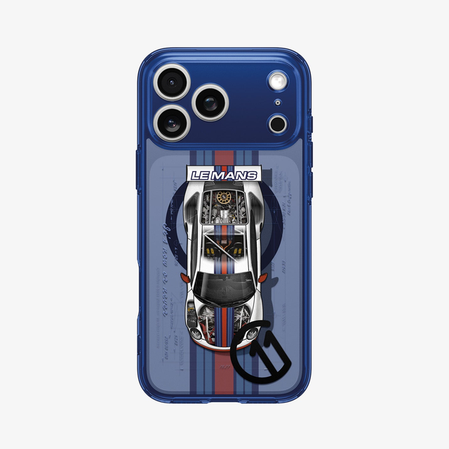
iPhone 17 Series - c11 Series Le Mans Edition (Mag Fit)
USD 38.49
Description
body { margin: 0; padding: 0; } *, ::after, ::before { box-sizing: border-box; } .product-description section { position: relative; width: 100%; } .product-description section:first-of-type { border-top-left-radius: 32px; border-top-right-radius: 32px; } .product-description section:last-of-type { border-bottom-left-radius: 32px; border-bottom-right-radius: 32px; } .product-description .section-container-fluid { width: 100%; max-width: 100%; margin: 0 auto; } .product-description .section-container { width: 100%; max-width: 1200px; margin: 0 auto; } @media (min-width: 1080px) { .product-description .section-container { padding: 0 4rem; } .product-description section:not(:first-of-type) { padding-bottom: 200px; } } @media (max-width: 1079.98px) { .product-description .section-container { padding: 0 2rem; } .product-description section:not(:first-of-type) { padding-bottom: 80px; } } .product-description img { width: 100%; height: auto; } /* ------------------------------------------------------------ Text Alignment ------------------------------------------------------------ */ .product-description .text-center { text-align: center; } .product-description .text-left { text-align: left; } .product-description .text-right { text-align: right; } /* ------------------------------------------------------------ Text Colors ------------------------------------------------------------ */ .product-description .text-dark * { color: #000; } .product-description .text-light * { color: #fff; } .product-description .text-info { color: #8d8d8f; } /* ------------------------------------------------------------ Visibility ------------------------------------------------------------ */ @media (min-width: 1080px) { .product-description .sq-mobile-view { display: none; } } @media (max-width: 1079.98px) { .product-description .sq-desktop-view { display: none; } } /* ------------------------------------------------------------ Headlines ------------------------------------------------------------ */ .product-description .section-header { max-width: 500px; margin: 0 auto; } .product-description .section-preheadline { font-weight: 400; line-height: 1.2; } .product-description .section-headline { font-weight: 800; line-height: 1.2; } .product-description .section-subheadline { font-weight: 400; line-height: 1.5; } @media (min-width: 1080px) { .product-description .section-header { padding: 3rem; } .product-description .section-preheadline { font-size: 20px; margin: 0 0 8px; } .product-description .section-headline { font-size: 48px; margin: 0 0 16px; } .product-description .section-subheadline { font-size: 18px; line-height: 1.5; margin: 0; } } @media (max-width: 1079.98px) { .product-description .section-header { padding: 3rem; } .product-description .section-preheadline { font-size: 18px; margin: 0 0 8px; } .product-description .section-headline { font-size: 36px; margin: 0 0 16px; } .product-description .section-subheadline { font-size: 16px; line-height: 1.5; margin: 0; } } .product-description .cta-button { display: inline-block; padding: 16px 32px; border-radius: 100px; background-color: #ffffff; border: 1px solid #ffffff; color: #000000; font-size: 20px; font-weight: 400; text-decoration: none; line-height: 1.5; margin: 0; transition: all 0.3s ease; cursor: pointer; } .product-description .cta-button:hover { background-color: #dedede; border-color: #dedede; color: #000000; } .product-description .section-header p + .cta-button { margin-top: 32px; } /* ------------------------------------------------------------ [Sections] Intro ------------------------------------------------------------ */ .section-intro { background-color: #1c1c1c; } @media (min-width: 1080px) { .section-intro .section-intro-banner { width: 100%; height: 1200px; object-fit: cover; } } /* ------------------------------------------------------------ [Sections] Highlights ------------------------------------------------------------ */ .section-highlights { background-color: #1c1c1c; } .section-highlights .section-header { max-width: 480px; } .section-highlights-feature-container { width: 100%; display: flex; flex-direction: row; flex-wrap: wrap; padding: 16px; margin: 0 auto; } .section-highlights-feature-item { flex: 0 0 auto; padding: 16px; } @media (min-width: 1080px) { .section-highlights-feature-item:nth-child(1) { width: 50%; } .section-highlights-feature-item:nth-child(2) { width: 50%; } .section-highlights-feature-item:nth-child(3) { width: 40%; } .section-highlights-feature-item:nth-child(4) { width: 30%; } .section-highlights-feature-item:nth-child(5) { width: 30%; } } .section-highlights-feature-item [class^="section-highlights-list-"] { position: relative; display: flex; flex-direction: column; justify-content: center; align-items: flex-start; background-color: #000000; height: 100%; border-radius: 32px; overflow: hidden; } .section-highlights-feature-item .section-highlights-list-text-item { padding: 40px; color: #ffffff; } .section-highlights-feature-item .feature-headline { font-size: 40px; font-weight: 800; line-height: 1.2; margin: 0 0 16px; } .section-highlights-feature-item .feature-description { font-size: 20px; font-weight: 400; line-height: 1.5; margin: 0; } .section-highlights-feature-item img { aspect-ratio: 1/1; width: 100%; height: 100%; object-fit: cover; object-position: center; } /* ------------------------------------------------------------ [Sections] Highlights ------------------------------------------------------------ */ .highlightSwiper { width: 100%; padding-top: 32px; } .highlightSwiper .swiper-wrapper { width: 100%; height: auto; } .highlightSwiper .swiper-wrapper .slide-header { width: 100%; padding: 40px 16px; text-align: center; color: #ffffff; } .highlightSwiper .swiper-wrapper .slide-image { aspect-ratio: 1/1; width: 100%; height: 100%; min-height: 300px; object-fit: cover; object-position: center; border-radius: 32px; overflow: hidden; } .highlightSwiper-pagination { display: block; width: 100%; padding: 16px; text-align: center; } .highlightSwiper-pagination .swiper-pagination-bullet { width: 16px; height: 16px; border-radius: 100px; background-color: #dddddd; margin: 0 8px; transition: all 1s ease; } .highlightSwiper-pagination .swiper-pagination-bullet-active { background-color: #ffffff !important; width: 48px; height: 16px; } /* ------------------------------------------------------------ [Sections] Daily Essentials ------------------------------------------------------------ */ .section-daily-essentials { background-color: #1c1c1c; } .section-daily-essentials img { aspect-ratio: 468/605; width: 100%; height: 100%; object-fit: cover; object-position: center; } @media (min-width: 1080px) { .section-daily-essentials-container { display: grid; grid-template-columns: repeat(2, 3fr); grid-auto-rows: minmax(300px, auto); gap: 32px; } .section-daily-essentials-item:nth-child(1) { grid-column: 1 / 2; grid-row: 1 / 3; } .section-daily-essentials-item:nth-child(2) { grid-column: 2 / 3; grid-row: 1 / 2; } .section-daily-essentials-item:nth-child(3) { grid-column: 1 / 2; grid-row: 3 / 4; } .section-daily-essentials-item:nth-child(4) { grid-column: 2 / 3; grid-row: 2 / 4; } } @media (max-width: 1079.98px) { .section-daily-essentials-container { display: grid; grid-template-columns: repeat(1, 4frr); grid-auto-rows: minmax(300px, auto); gap: 32px; } .section-daily-essentials-item:nth-child(1) { grid-column: 1 / 2; grid-row: 2 / 3; } .section-daily-essentials-item:nth-child(2) { grid-column: 1 / 2; grid-row: 1 / 2; } .section-daily-essentials-item:nth-child(3) { grid-column: 1 / 2; grid-row: 3 / 4; } .section-daily-essentials-item:nth-child(4) { grid-column: 1 / 2; grid-row: 4 / 5; } } .section-daily-essentials-item [class^="section-daily-essentials-list-"] { position: relative; display: flex; flex-direction: column; justify-content: center; align-items: flex-start; background-color: #ffffff; height: 100%; border-radius: 16px; overflow: hidden; } .section-daily-essentials-item .section-daily-essentials-list-text-item { padding: 40px; color: #000000; } .section-daily-essentials-item .essential-headline { font-size: 40px; font-weight: 800; line-height: 1.2; margin: 0 0 16px; } .section-daily-essentials-item .essential-description { font-size: 20px; font-weight: 400; line-height: 1.5; margin: 0; } /* ------------------------------------------------------------ [Sections] Series Inspiration ------------------------------------------------------------ */ .section-series-inspiration { background-color: #1c1c1c; } .section-series-inspiration-container { position: relative; } .section-series-inspiration-button, .edition-inspiration-button { position: absolute; top: 0; right: 0; margin: 32px; width: 40px; height: 40px; color: #ffffff; background-color: transparent; border: none; border-radius: 100px; cursor: pointer; transition: all 0.3s ease; z-index: 1; } @media (min-width: 1080px) { .section-series-inspiration .section-body { position: relative; max-width: 1200px; padding: 0 4rem; margin: 0 auto; } .section-series-inspiration-container { border-radius: 32px; overflow: hidden; } } @media (max-width: 1079.98px) { .section-series-inspiration.section-body { position: relative; padding: 0; border-radius: 0; } } /* ------------------------------------------------------------ Modal Styles ------------------------------------------------------------ */ .edition-inspiration-button { background: linear-gradient( 135deg, rgba(255, 255, 255, 0.1), rgba(255, 255, 255, 0.05) ); backdrop-filter: blur(20px); -webkit-backdrop-filter: blur(20px); border: 1px solid rgba(255, 255, 255, 0.2); box-shadow: 0 8px 32px rgba(0, 0, 0, 0.3), inset 0 1px 0 rgba(255, 255, 255, 0.2); padding: 4px; border-radius: 100px; transition: all 0.3s ease; } .edition-inspiration-button:hover { background: rgba(255, 255, 255, 0.25); } #modal-subscription { display: none; position: fixed; z-index: 1000; left: 0; top: 0; width: 100%; height: 100%; background-color: rgba(0, 0, 0, 0.6); } #modal-subscription .modal-content { position: absolute; top: 50%; left: 50%; transform: translate(-50%, -50%); background-color: #1c1c1c; padding: 48px; width: 90%; max-width: 740px; min-height: 600px; border-radius: 32px; display: flex; align-items: center; } #modal-subscription .modal-header { position: absolute; top: 20px; right: 20px; z-index: 1001; display: flex; justify-content: center; align-items: center; width: 50px; height: 50px; background-color: #ffffff; border-radius: 100px; cursor: pointer; } #modal-subscription .modal-header .close { display: flex; justify-content: center; align-items: center; transition: all 0.3s ease; } #modal-subscription .modal-header .close svg { width: 24px; height: 24px; color: #1c1c1c; } #modal-subscription .modal-header:hover { background-color: #000000; } #modal-subscription .modal-header:hover svg { color: #ffffff; } #modal-subscription .modal-text-content { width: 100%; text-align: center; margin-bottom: 32px; } #modal-subscription input[type="email"] { text-align: center; } #modal-subscription button[type="submit"] { border-radius: 100px; } #modal-content { display: none; position: fixed; z-index: 1000; left: 0; top: 0; width: 100%; height: 100%; } #modal-content .modal-content { position: absolute; top: 50%; left: 50%; transform: translate(-50%, -50%); background: linear-gradient( 135deg, rgba(255, 255, 255, 0.1), rgba(255, 255, 255, 0.05) ); backdrop-filter: blur(20px); -webkit-backdrop-filter: blur(20px); border: 1px solid rgba(255, 255, 255, 0.2); box-shadow: 0 8px 32px rgba(0, 0, 0, 0.3), inset 0 1px 0 rgba(255, 255, 255, 0.2); padding: 48px; width: 90%; max-width: 800px; border-radius: 32px; } .modal-body { padding: 0; } .modal-image-container { width: 100%; text-align: center; color: #ffffff; } .modal-image { width: 100%; height: auto; border-radius: 16px; object-fit: contain; box-shadow: 0 4px 20px rgba(0, 0, 0, 0.2); } #modal-content .modal-headline { color: #ffffff; } @media (min-width: 1080px) { .modal-text-content { padding: 40px; color: #ffffff; } .modal-headline { font-size: 48px; font-weight: 800; line-height: 1.2; margin: 0 0 16px; } .modal-subheadline { font-size: 20px; font-weight: 400; line-height: 1.5; margin: 0; } } @media (max-width: 1079.98px) { .modal-content { width: 95%; margin: 20px auto; padding: 15px; } .modal-header { top: 15px; right: 15px; } .modal-text-content { padding: 16px 0; color: #ffffff; } .modal-content .modal-image { cursor: pointer; } .modal-headline { font-size: 24px; font-weight: 800; line-height: 1.2; margin: 0 0 16px; } .modal-subheadline { font-size: 16px; font-weight: 400; line-height: 1.5 !important; margin: 0; } .close { width: 40px; height: 40px; font-size: 24px; } } iPhone 17 Pro Series Le Mans Edition Where heritage meets horsepower. Built for pure performance. Tuned for obsession. Subscribe Hexa-layering technology Discover 3D Spatial Effect graphics with Hexa-Layer Digital Print. Meet the new standard of top- quality design. The unique detail mimics the complexity of time with layers of in-depth printing that's in a league of its own. All - around protection Camera guard and air-cushion technology keep your iPhone 17 Pro safe every day. Hexa-layering technology. Discover 3D Spatial Effect graphics with Hexa-Layer Digital Print. Meet the new standard of top- quality design. The unique detail mimics the complexity of time with layers of in depth printing that's in a league of its own. Safeguard the essentials. Raised edges prevent scratches on screen and camera at all angles. Protection you can trust. Air Cushion™ Technology absorbs and mitigates all impacts in each corner. var swiper = new Swiper(".highlightSwiper", { slidesPerView: 1, spaceBetween: 32, pagination: { el: ".highlightSwiper-pagination", clickable: true, }, }); Daily essentials Day to day essentials covered. Easy access Precise cutouts for easy and full access to all the buttons on iPhone. Simply charge on. We know it’s a hassle to take the case off. So, simply charge on with the case on via wireless charger or MagSafe charger. It’s now or never. c11 designlab Stay ahead of new drops. Subscribe and be the first to explore fresh c11 designs every month. // Modal functionality document.addEventListener("DOMContentLoaded", function () { console.log("Modal script loaded"); // Get modal elements const modalSubscription = document.getElementById("modal-subscription"); const modalContent = document.getElementById("modal-content"); // Get button elements const ctaButton = document.querySelector(".cta-button"); const inspirationButton = document.querySelector( ".edition-inspiration-button" ); console.log("CTA Button found:", ctaButton); console.log("Inspiration Button found:", inspirationButton); console.log("Modal Subscription found:", modalSubscription); console.log("Modal Content found:", modalContent); // Function to open modal function openModal(modal) { if (modal) { modal.style.display = "block"; document.body.style.overflow = "hidden"; console.log("Modal opened:", modal.id); } } // Function to close modal function closeModal(modal) { if (modal) { modal.style.display = "none"; document.body.style.overflow = "auto"; console.log("Modal closed:", modal.id); } } // CTA Button → Subscription Modal if (ctaButton && modalSubscription) { ctaButton.addEventListener("click", function (e) { e.preventDefault(); e.stopPropagation(); console.log("CTA button clicked"); openModal(modalSubscription); }); } else { console.error("CTA button or subscription modal not found"); } // Inspiration Button → Content Modal if (inspirationButton && modalContent) { inspirationButton.addEventListener("click", function (e) { e.preventDefault(); e.stopPropagation(); console.log("Inspiration button clicked"); openModal(modalContent); }); } else { console.error("Inspiration button or content modal not found"); } // Close buttons const closeBtns = document.querySelectorAll(".close"); closeBtns.forEach(function (closeBtn) { closeBtn.addEventListener("click", function (e) { e.preventDefault(); e.stopPropagation(); const modalId = this.getAttribute("data-modal"); const modal = document.getElementById(modalId); console.log("Close button clicked for modal:", modalId); closeModal(modal); }); }); // Close modal when clicking outside of modal content window.addEventListener("click", function (event) { if (event.target.classList.contains("modal")) { console.log("Modal background clicked"); closeModal(event.target); } }); // ESC key to close modals document.addEventListener("keydown", function (e) { if (e.key === "Escape") { if ( modalSubscription && modalSubscription.style.display === "block" ) { closeModal(modalSubscription); } if (modalContent && modalContent.style.display === "block") { closeModal(modalContent); } } }); // Modal image click to close modal (only for mobile screens) const modalImage = document.querySelector("#modal-content .modal-image"); if (modalImage && modalContent) { modalImage.addEventListener("click", function (e) { // Check if screen width is 1079.98px or less if (window.matchMedia("(max-width: 1079.98px)").matches) { e.preventDefault(); e.stopPropagation(); console.log("Modal image clicked on mobile - closing modal"); closeModal(modalContent); } }); } }); // Omnisend 폼 성공 이벤트 리스너 document.addEventListener("DOMContentLoaded", function () { const modalTitle = document.querySelector(".modal-title"); const modalText = document.querySelector(".modal-text"); const modalContent = document.querySelector(".modal-content-wrapper"); let hasChanged = false; // 변경 여부를 추적하는 플래그 // Omnisend 폼의 성공 섹션 감지 const checkSuccess = function () { const successSection = document.querySelector( ".omnisend-form-67ec2b6e1483d5800c841a04-success-sections-container" ); if ( successSection && window.getComputedStyle(successSection).display !== "none" && !hasChanged ) { // 모달 내용 변경 (한 번만 실행) modalTitle.textContent = "Nice to have you!"; modalText.innerHTML = "You're all set to receive the latest designs and news from c11."; // Omnisend 폼 숨기기 const omnisendForm = document.getElementById( "omnisend-embedded-v2-67ec2b6e1483d5800c841a04" ); if (omnisendForm) { omnisendForm.style.display = "none"; } hasChanged = true; // 변경되었음을 표시 clearInterval(checkInterval); // 인터벌 중지 } }; // 주기적으로 성공 섹션 확인 const checkInterval = setInterval(checkSuccess, 500); // 폼 제출 버튼 클릭 이벤트 감지 const submitButton = document.querySelector( "#omnisend-form-67ec2b6e1483d5800c841a04-action-627932485028ebd8c6660c51" ); if (submitButton) { submitButton.addEventListener("click", function () { if (!hasChanged) { // 아직 변경되지 않은 경우에만 실행 setTimeout(checkSuccess, 1000); } }); } }); More than just protection. Explore what we do and how we do it. Our Rewards Protection with benefits for our Reward members. Get it Faster We provide discounted expedited shipping for our Elite and Executive members. Seasonal Coupon Every season we provide our Elite and Executive members with reward coupons with fresh new gears. Executive Care Team We've created a dedicated team where we personally handle anything from warranty service to all questions. Join Us Our Story
Get a deal on iPhone 17 Series - c11 Series Le Mans Edition (Mag Fit)
You could save on Spigen iPhone 17 Series - c11 Series Le Mans Edition (Mag Fit) with a Spigen promo code:

15% off
worked 10 months ago